New onboarding flow for book of business
Overview
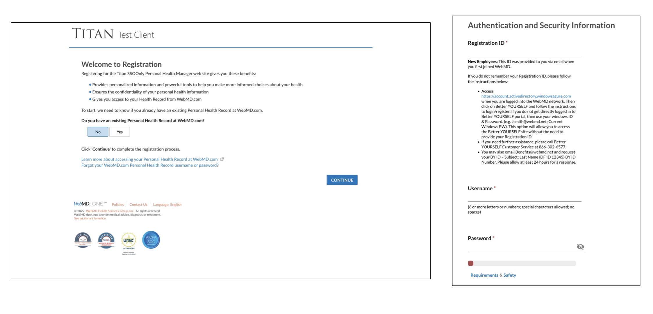
The company had not touched the onboarding experience in a number of years and the old flow was hard for users to complete, didn’t have the right tone and voice, lacked engaging visuals and was not customizable for clients. I was the lead content designer working to update the experience and copy. The flow was used by millions of participants within hundreds of WHS clients.
I collaborated with the product designer, product manager, multiple engineers and the UX manager.
What I did
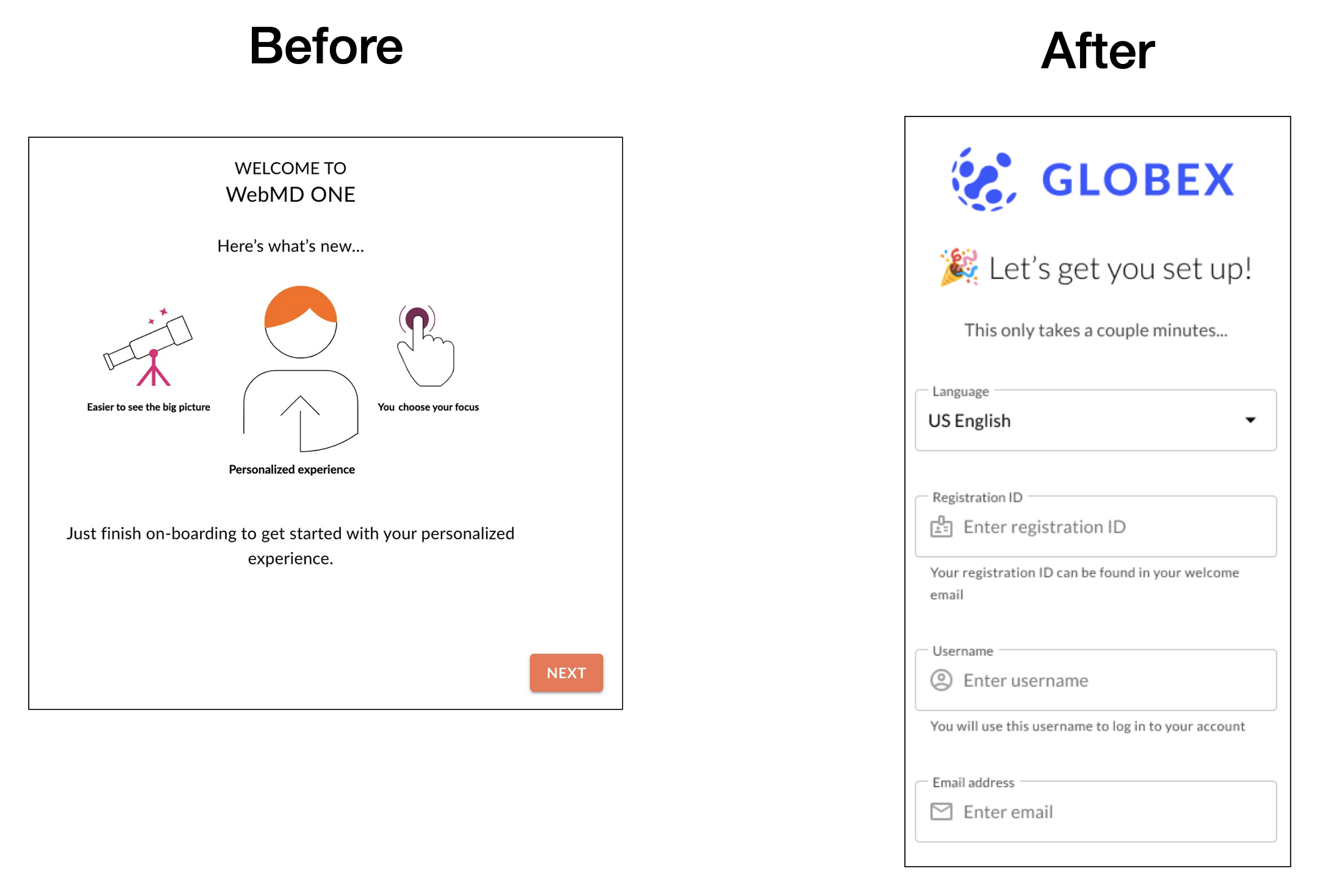
The old experience was built around desktop. But most users were onboarding on their phones. We designed around the mobile experience to bring it up to onboarding best practices and modern standards.
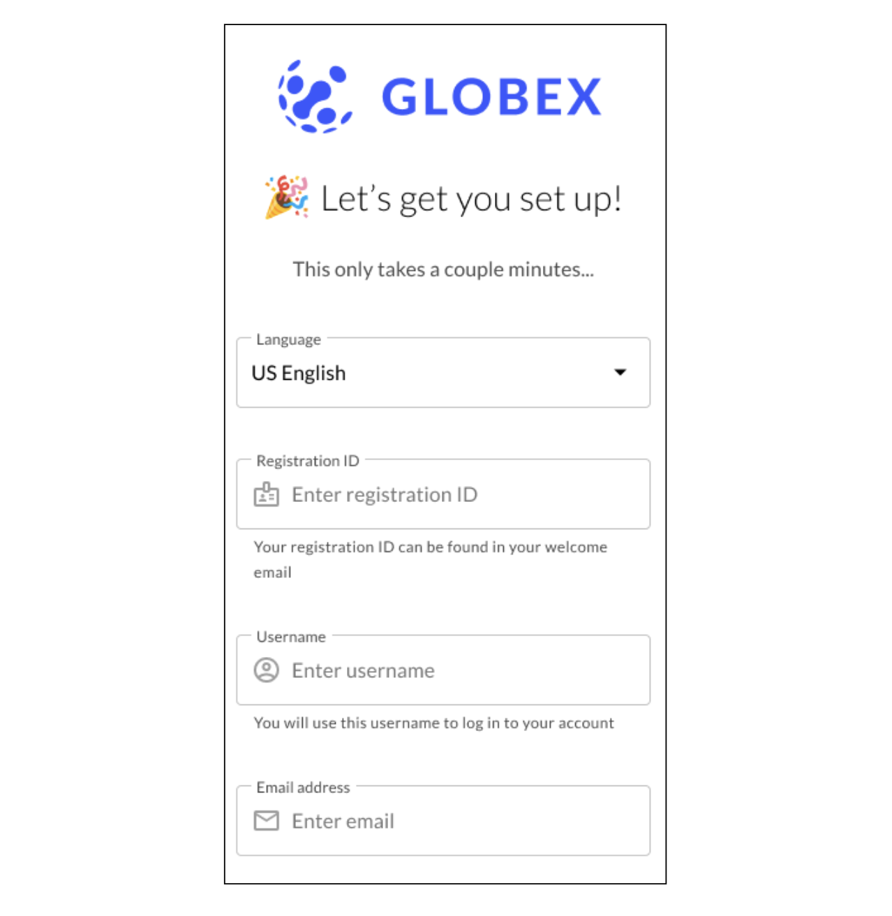
- I user tested multiple versions of the initial screen and people liked the emoji and the exciting and encouraging copy the best.
- I worked with the product designer to consolidate multiple of the old screens into just one screen with multiple easy-to-fill out fields.
- I also added an expectation of how long onboarding will take. Giving a time estimation can invite more users to register to something when they know it won’t take that long.
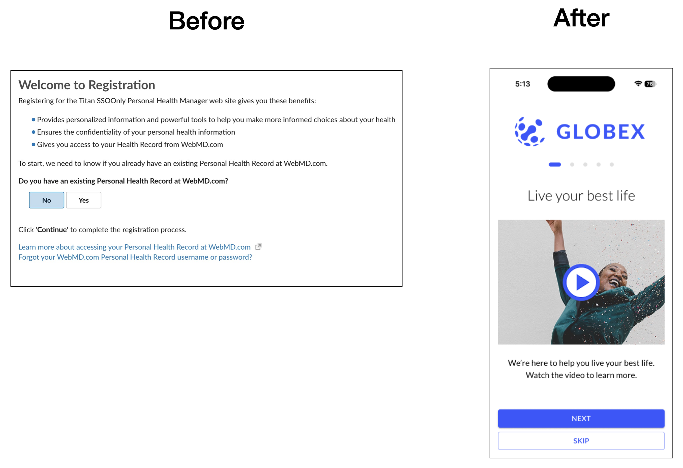
I researched, wrote the script for and created a video showing participants how to get the most out of their platform and health benefits.
- I also worked with our video creation platform and engineering to personalize the video so it included the user’s actual well-being program name.
- The video helps set expectations for users and gives them the value prop of why they should sign up.
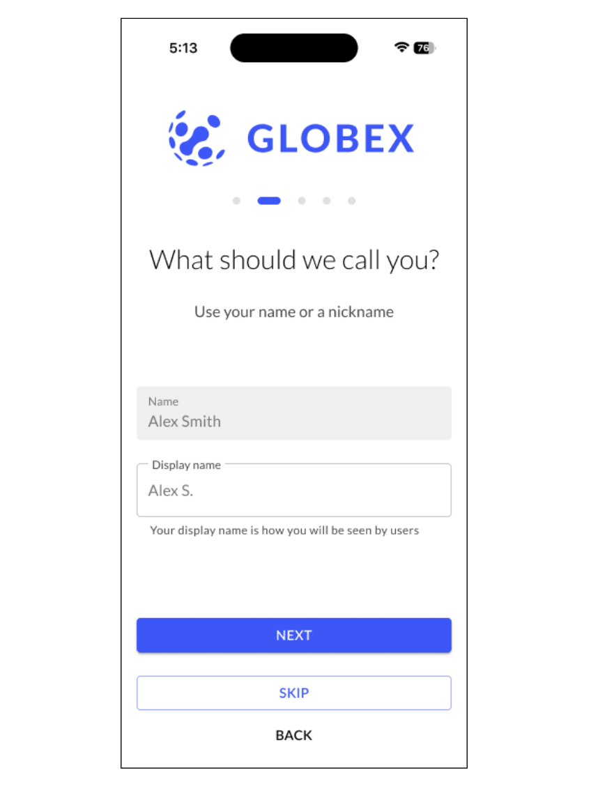
User testing showed people wanted simple questions to guide them through the onboarding flow.
- I updated the copy to questions, which are always much easier for users to answer than a plain header statement.
- I also added a progress bar at the top so users can see where they were in the process.
- I added more clarity around their display name and how it would be shown.
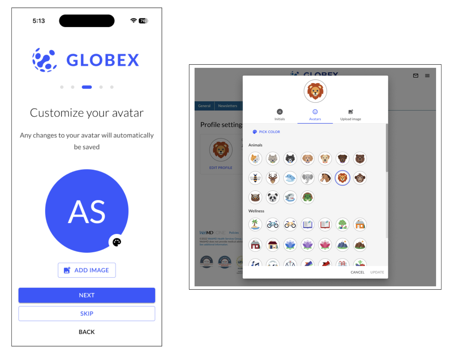
I worked with the designers and engineers to redesign and simplify the avatar profile section to make it more clear what their options were.
- User testing showed that the more people customized their health accounts, the more likely they would log back in and play health games, take their assessment, earn rewards, etc. So we added fun avatars during onboarding!
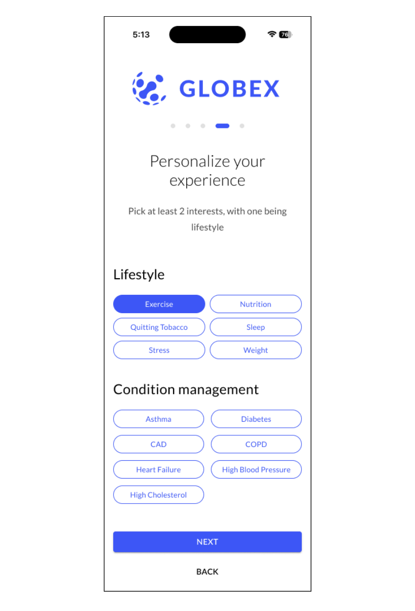
Redesigned the “pick your interests” section and combined two screens into just one. Also added missing explainer text about picking at least two (this clarity was not in the original experience)
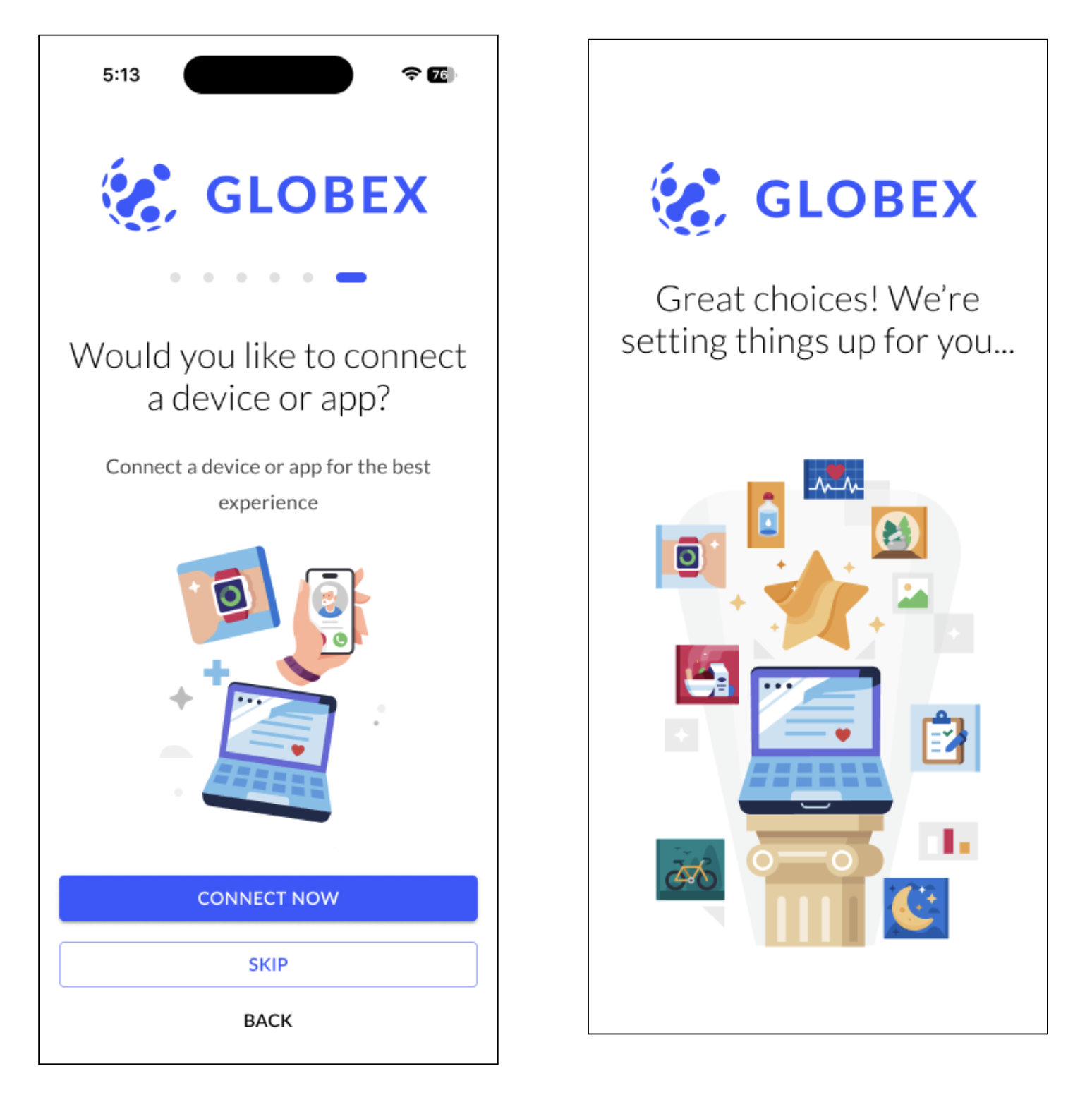
The rewritten experience made clear which steps they could skip but also what the value prop was. And I worked with the product designer and engineers to dramatically improve the ease of connecting a device right from onboarding. I also added some excitement and encouragement at the end of the flow.
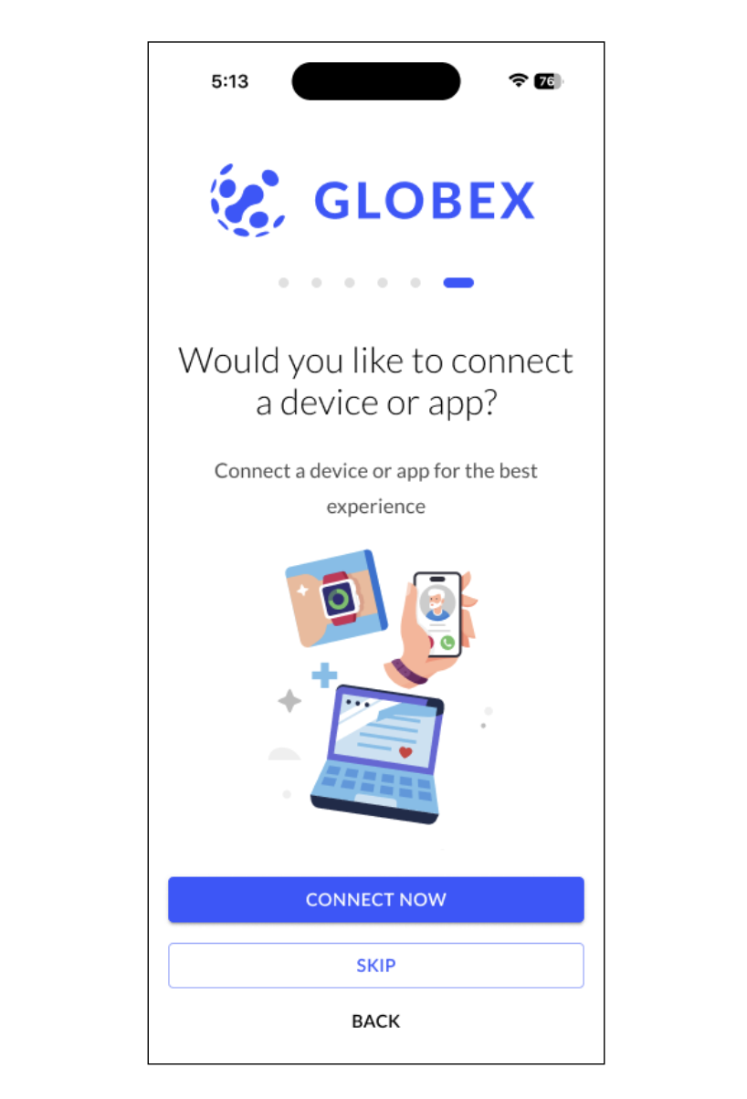
Added color and visuals to this screen and the header in the form of a question performed the best in user testing.
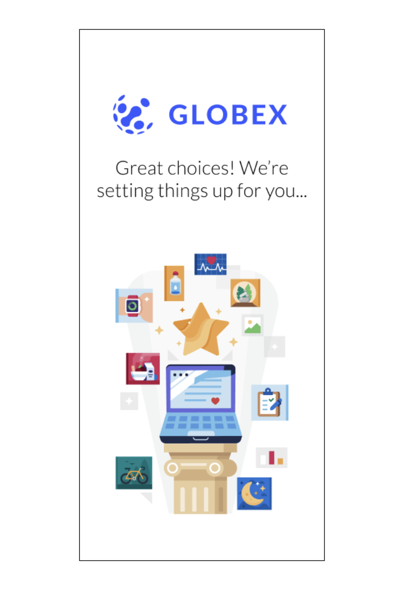
The positive and encouraging tone in the copy along with colorful visuals at the end was another big improvement over the old version.
Results
I didn’t have access to business metrics after the new onboarding flow launched across hundreds of clients, but early feedback I saw was extremely positive. Just adding the video alone was a massive improvement.