Redesigning the entire health coaching experience
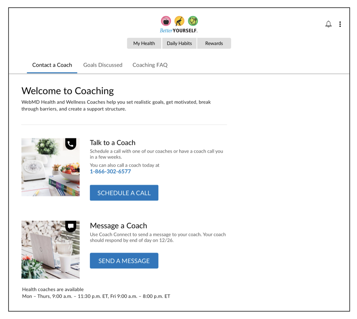
Overview
The company’s health coaching product was a big revenue driver. But the UX, UI and copy had not been touched in a long time. Redesigning the entire end-to-end health coaching experience would make it easier for participants to connect with health coaches to make progress on their goals. And for the business, we could remove barriers to engagement and increase revenue.
I collaborated with the product designer, product manager, multiple engineers, coaching operations, the Director of Clinical Operations, UX manager, Senior Product Marketing Manager and customer support operations.
How health coaching works
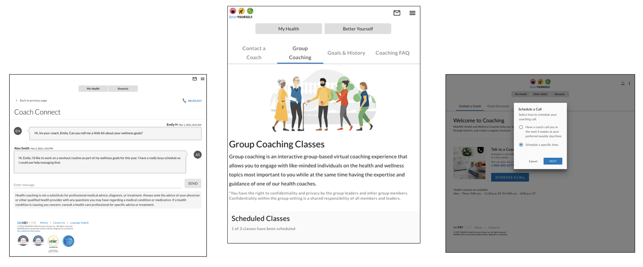
Clients of WebMD Health Services (employers, health plans, etc.) can purchase a variety of packages including coaching sessions, Coach Connect chat, classes, onsite coaching, etc.
- Participants are then shown their options based on what their company offers.
- We had to design for ALL use cases.
Challenges
- In the past, changes in the coaching experience had led to drops in revenue. We had to make sure our redesign increased conversions instead of decreased metrics.
- Coaching involved tentacles that spread into a ton of different areas of the business and platform
- The scope included coaching scheduling, classes, emails and comms, hardcopy letters, client customization, FAQs, onsite coaching vs. virtual, and more!
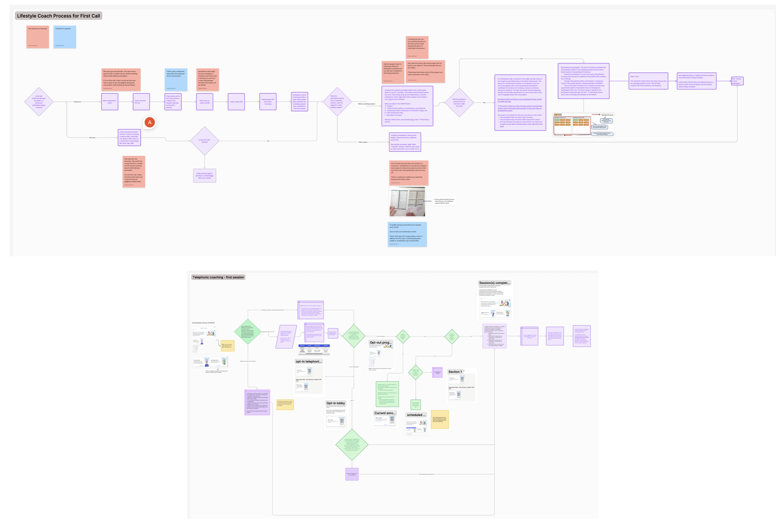
This is an example of the flows related to just a participant’s first call
What I did
- My approach to something this complex is to first understand how the product works. Once I become a subject matter expert, I can then make the value props and overall flow much more clear for users.
- I always approach new projects with a curiosity-first mindset. Asking questions and getting to the why behind things.
- I wanted participants to understand exactly how they could connect and get value out of working with a coach. I also think deeply about how to reduce complexity (reduce clicks, cut copy, etc.).
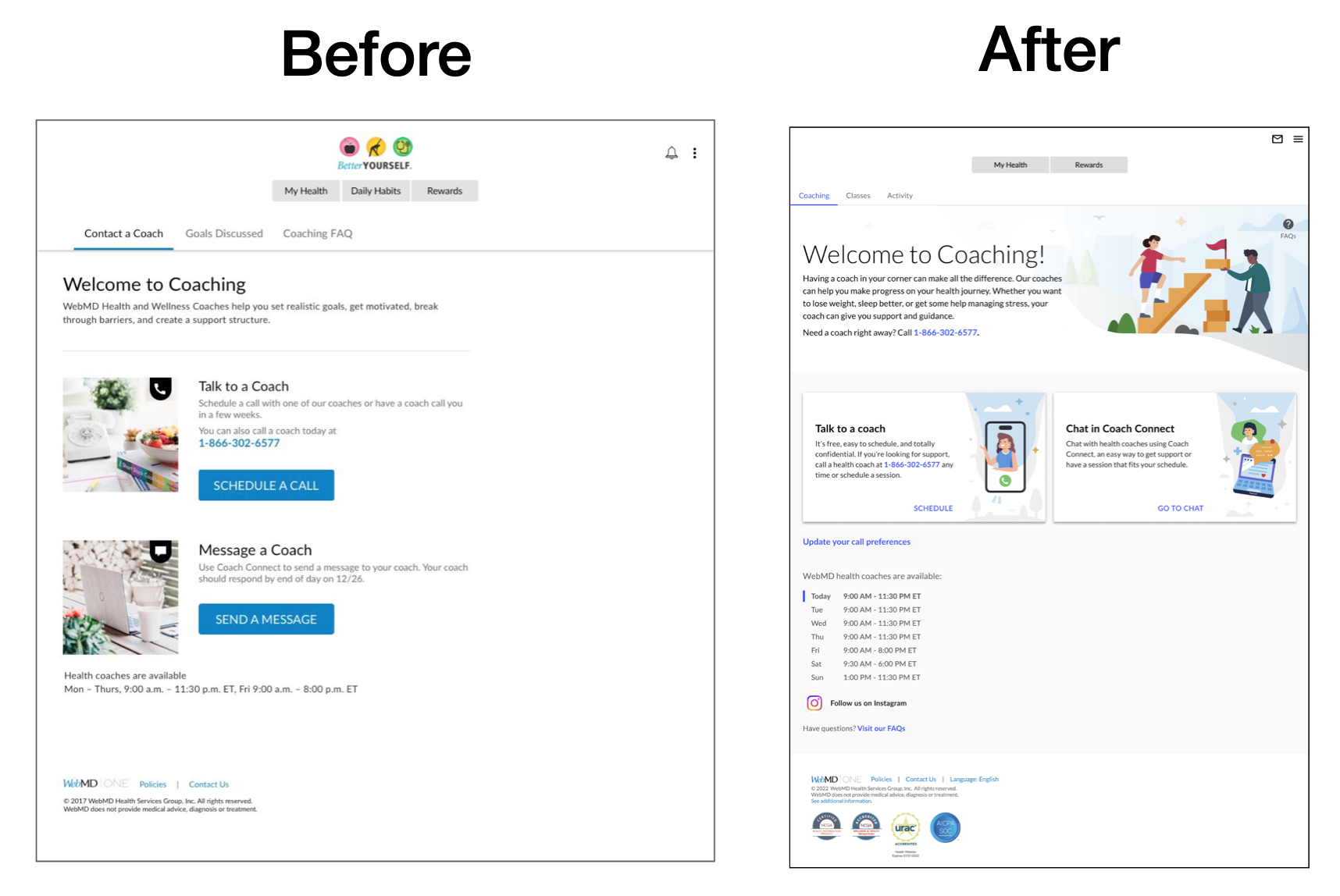
Making the coaching lobby more clear to users was a big goal. User testing and internal research showed that many participants didn’t know what they could do on the coaching homepage and what the different sections were. This led to low engagement and low signups.
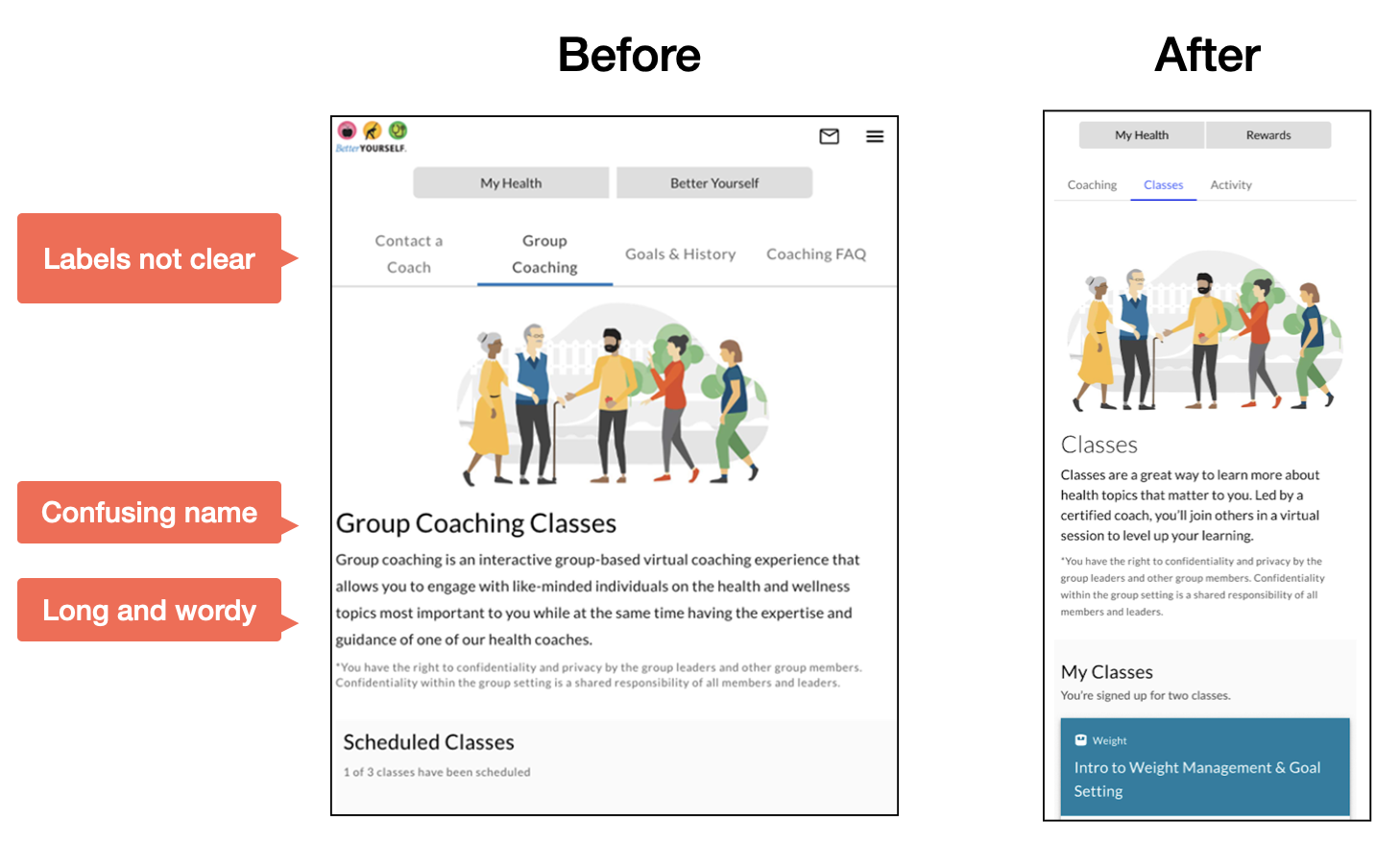
External and internal user testing showed the name Group Coaching Classes almost made it sound like a group therapy session. Yet these were simply educational classes that coaches taught on a variety of topics. So I renamed the section to Classes and made it more clear what users were signing up for.
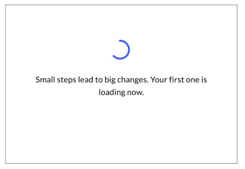
This is a new loading state. Most of the copy on the platform was very cold and clinical. Warming up the copy and making it more friendly was low-hanging fruit but still important!
Making it easy to call in
- We discovered that participants can call any time and don’t have to schedule. It’s a win-win since the business makes money on these call-ins and the user gets support right away!
- But the lobby and flow didn’t make this very clear. So we made an overarching goal to make it a lot clearer to users that they can call and when.
- The goal? Make it super obvious that users could call in.
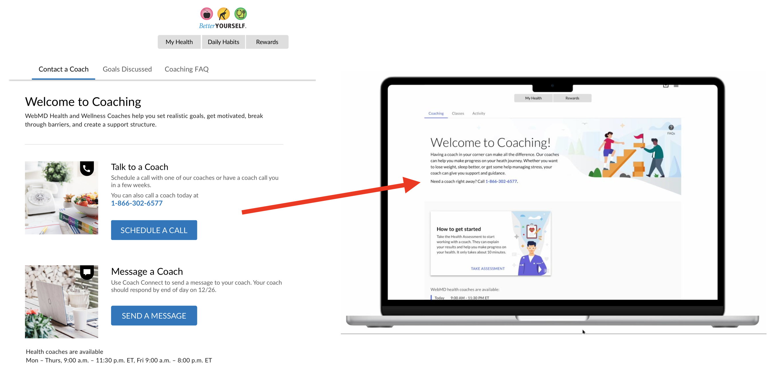
We moved the phone number in the main lobby text under the header to make it jump out more.
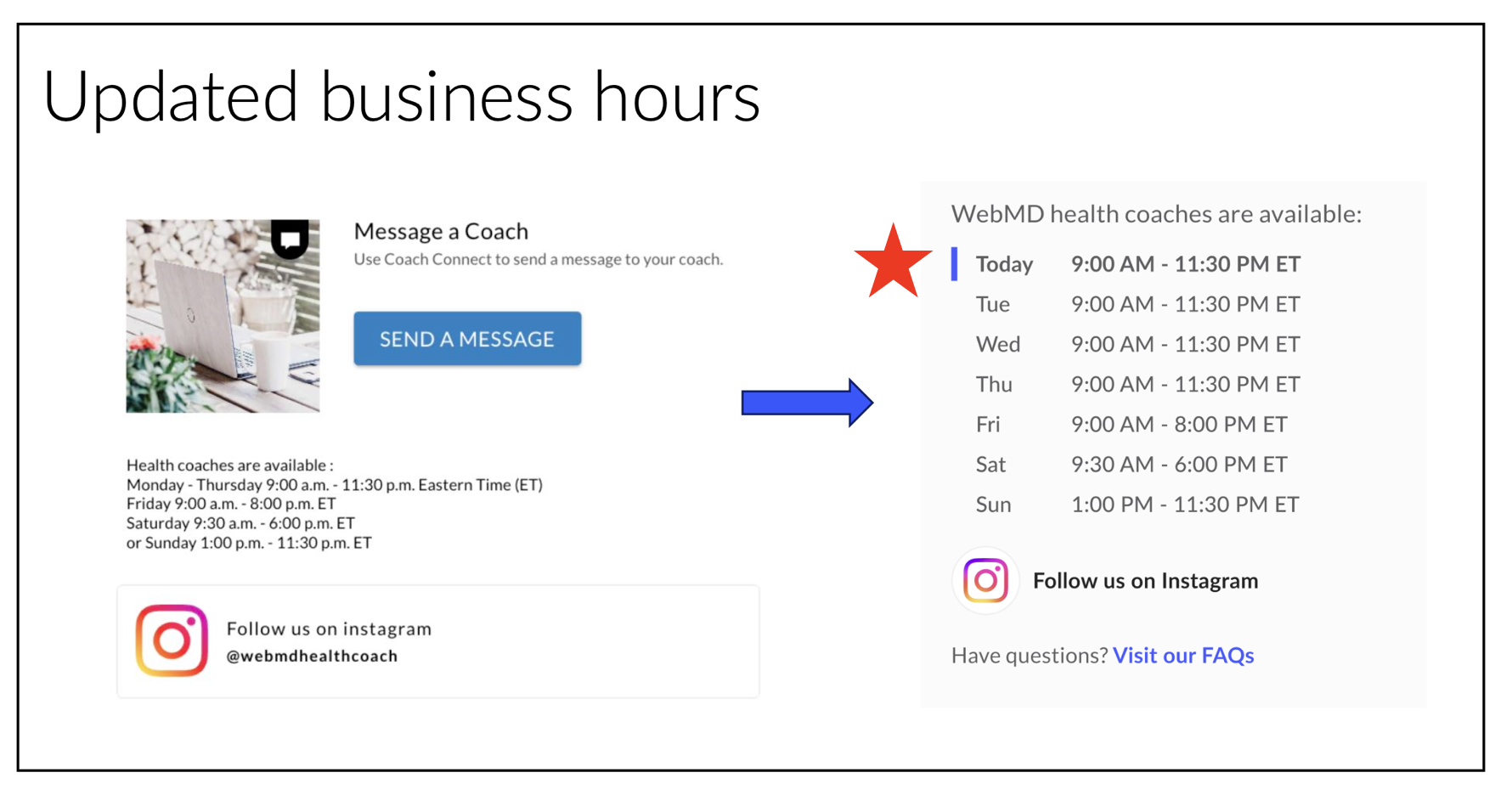
I researched best practices for listing business hours on similar websites and platforms and user tested to come up with the new version. I wanted to make it crystal clear that coaches were available now for users to call in. I worked with engineers to dynamically highlight the day of the week for the user and added new content design standards to our style guide for how we show dates and times.
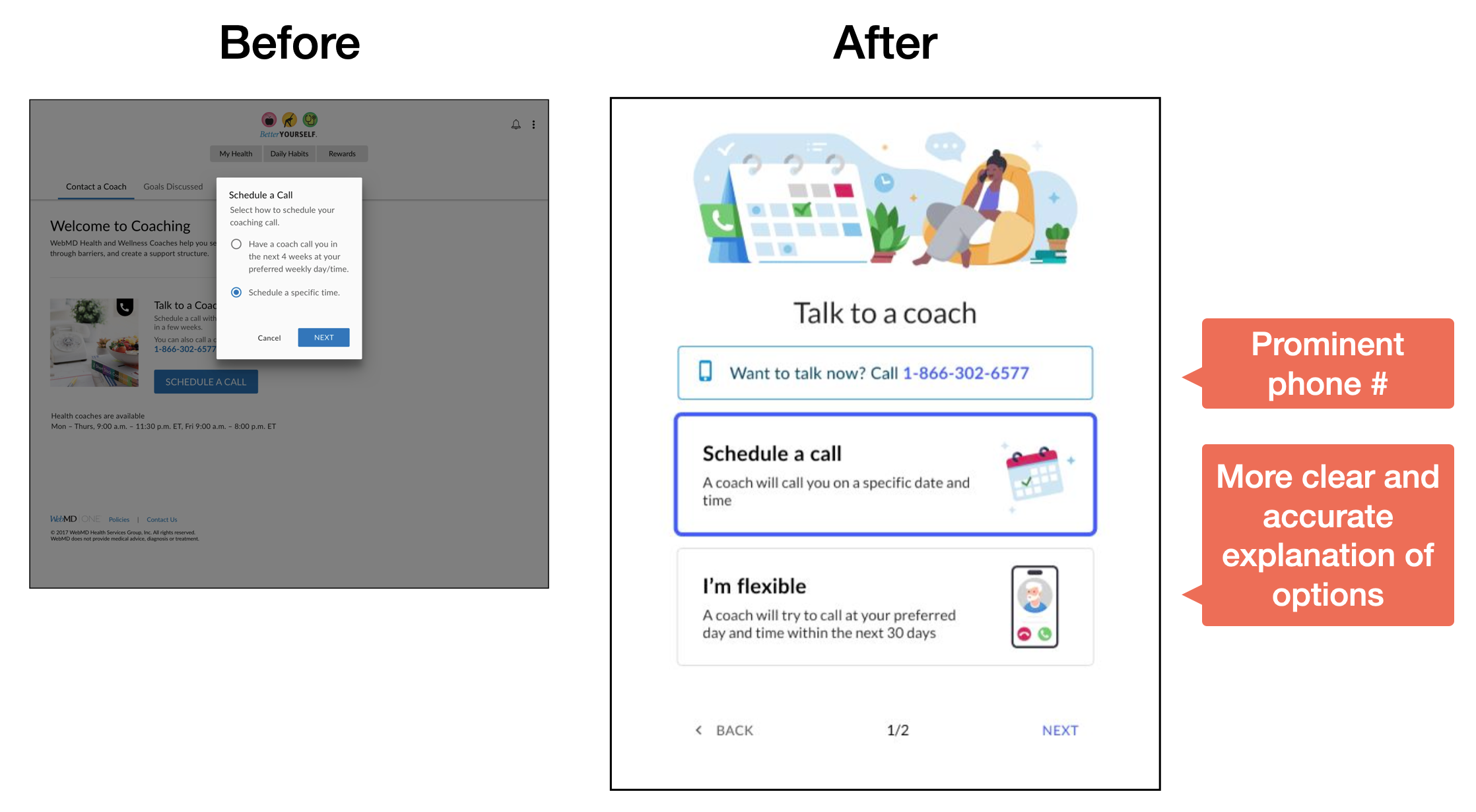
This is a before and after of the scheduler. Lots of work went into making this more clear, visually appealing and user friendly.
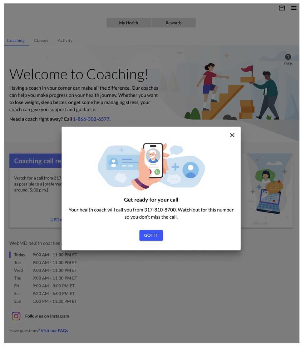
Once they scheduled their call, we celebrated with them! Another example of problem solving is when we pinpointed an issue where users weren’t answering when coaches called because it showed up looking like spam. Adding the number in the submission confirmation modal and telling them “watch out for this so you don’t miss it” prepped the user and led to more pick-ups.
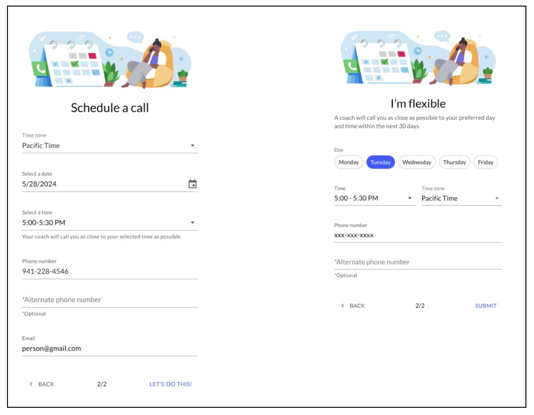
The final redesigned scheduler form. Changing the bottom right button text to “Let’s do it!” to add a bit more excitement and to meet the user where they are emotionally.
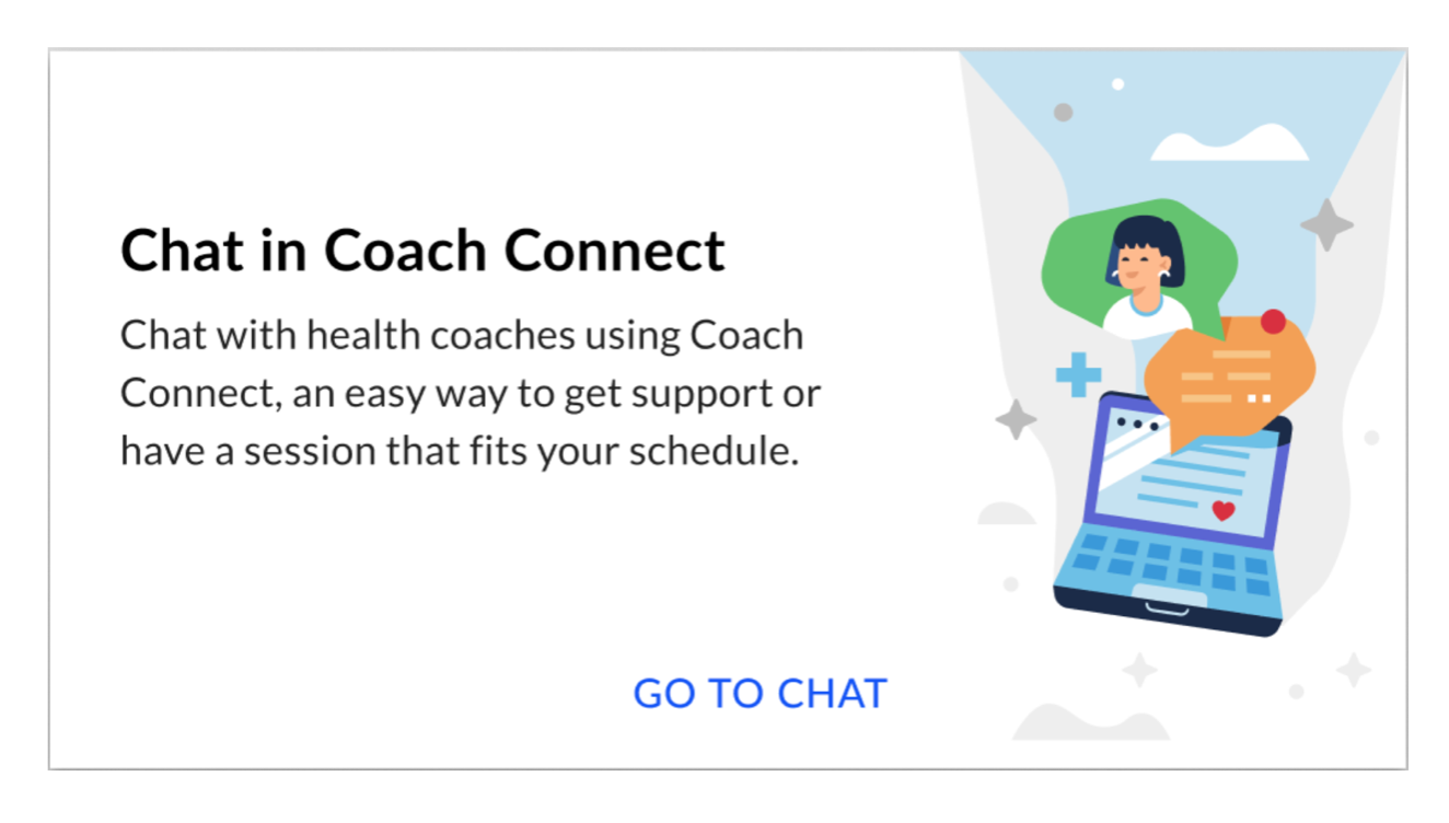
For clients with coaching chat sessions turned on, we empowered participants with convenient ways to get support “on their schedule.”
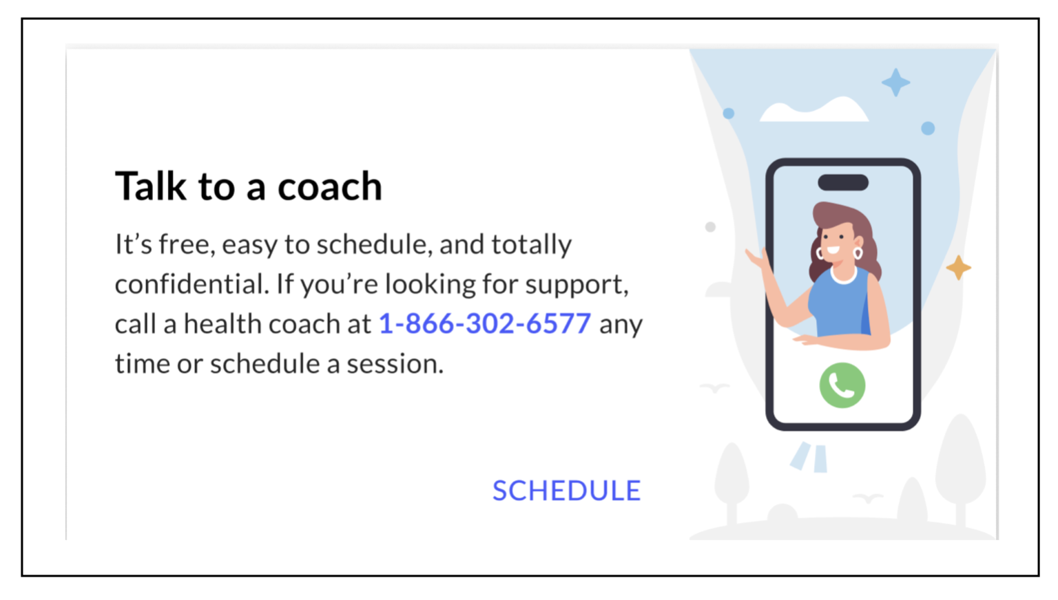
Clear headline and related Call to Action card in the Lobby. Clear value props, “free,” “easy” and “confidential.” Phone number prominent. I also worked with the designer to make illustrations more colorful and appealing (a lot of user feedback showed our platform was too white)
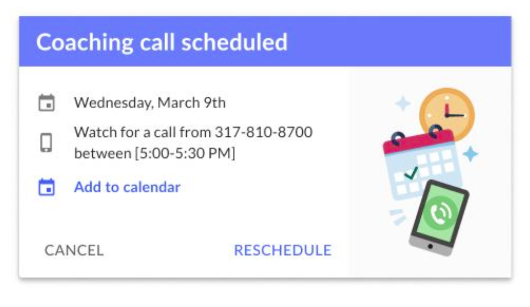
We added new cards in the Lobby to make it very clear that users had a call scheduled, and how to cancel or reschedule, etc.
Results
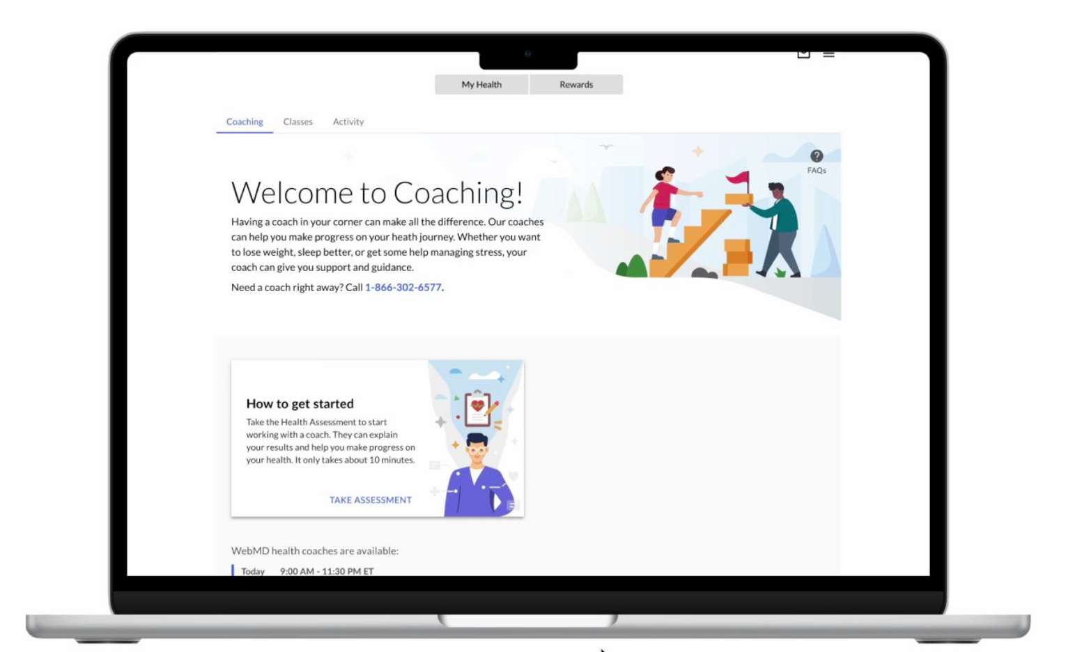
- 37% increase in total visits to the Coaching homepage YOY
- 56% YOY increase in Coaching Class sign-ups, a big revenue driver
- Brought reading level down from College to 7th grade
- Increased conversion rate for coaching flow by 16.5%
After the launch of the new flow, we saw great user and business results.