Redesigning a technical integration for new Meta AI ad product
Overview
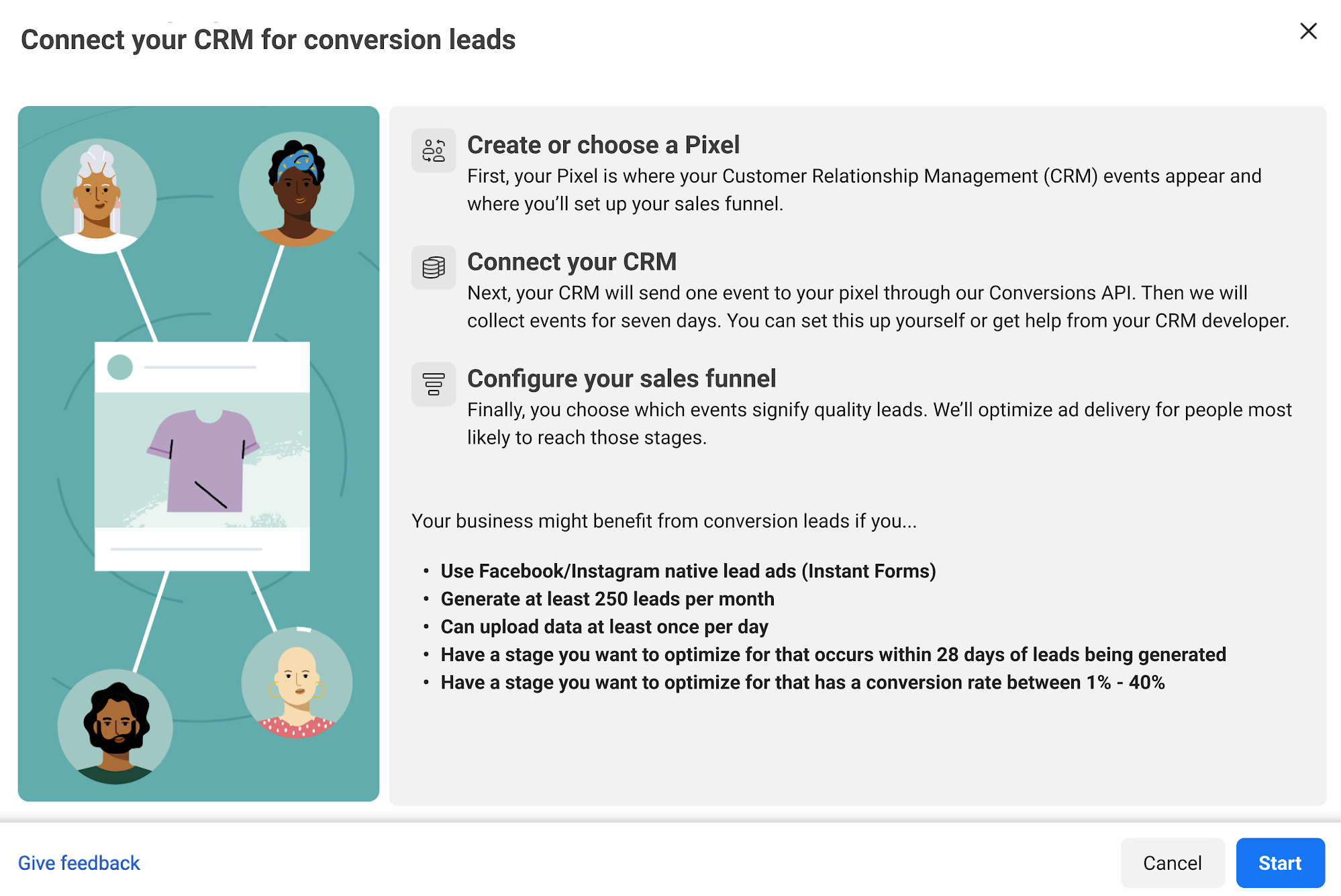
I worked on a major redesign of Meta’s manual CRM integration flow for Conversion Leads, a Facebook ad product that helped advertisers improve lead quality by sending CRM data back to Meta.
The product had strong business potential, but the manual setup flow was too technical and difficult to complete. Only a small percentage of advertisers were finishing the integration, which meant many businesses were not getting the full value of the product.
My role was to make the experience clearer across the product flow, developer documentation, help content, error states, and supporting marketing materials.
Conversion Leads let advertisers improve ad performance by sharing CRM data back to Meta, so the system could optimize for people more likely to become qualified leads.
The problem
Advertisers could connect their CRM through a third-party integration or complete the manual setup themselves. The manual path was the hard path, and it was creating friction for advertisers and internal teams.
- The integration flow was highly technical
- The experience used confusing jargon and long noun strings
- Lack of context with me being new to the company/product
- User testing wasn’t in the timeline
- Product, marketing, and documentation teams were not fully aligned on terminology
- The team had an aggressive launch timeline
- Sales teams were hesitant to push the product because the setup experience was hard to explain
What I did
- Updated and improved developer documentation so it matched the redesigned product experience.
- Created and revised in-product guidance, then decided when short in-flow guidance was enough versus when to send users to longer external documentation.
- Audited terminology across product, developer docs, help center content, and marketing materials.
- Turned technical jargon into clearer, more actionable language for advertisers and developers.
- Rewrote error messages so users could understand what went wrong and how to fix it.
- Partnered with product, engineering, UXR, business solutions engineering, and editorial teams to get the content ready for launch.
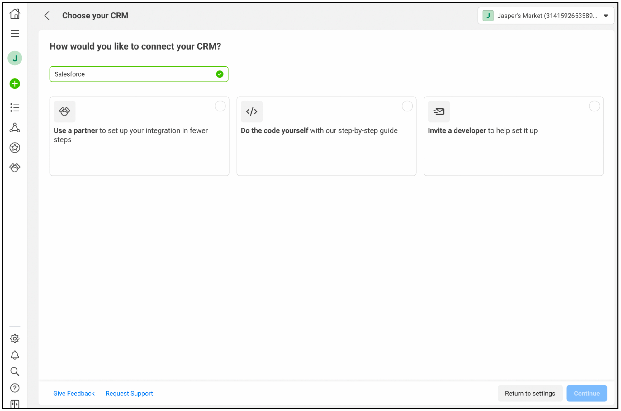
Updated header to a question to make it easier for users (marketers/devs). Header used to say “Conversion leads optimization integration.” Added user benefits to the options and more plain language. I dramatically cut copy on this page to limit the cognitive load when users were choosing their integration.
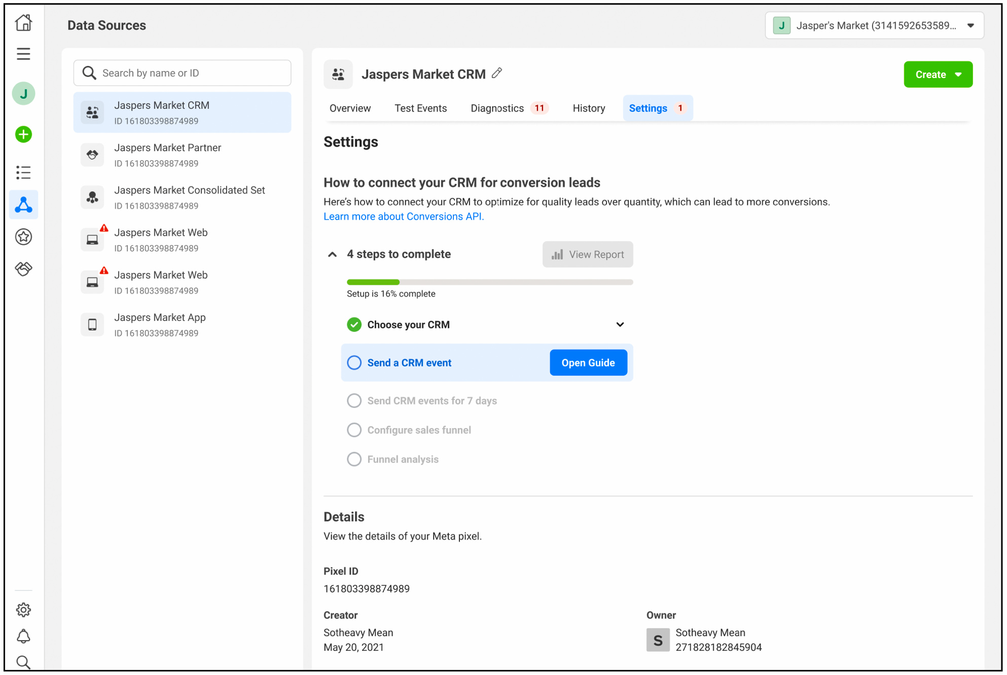
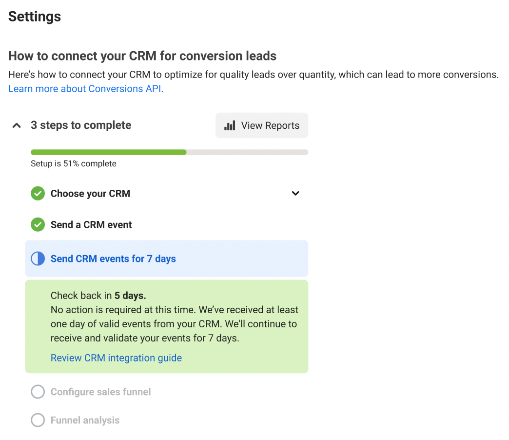
I also cut and clarified content in the progress tracker so users could better understand where they were in the process and what still needed to happen. I worked with the product designer to add colors (green, blue, gray) to make it super simple.
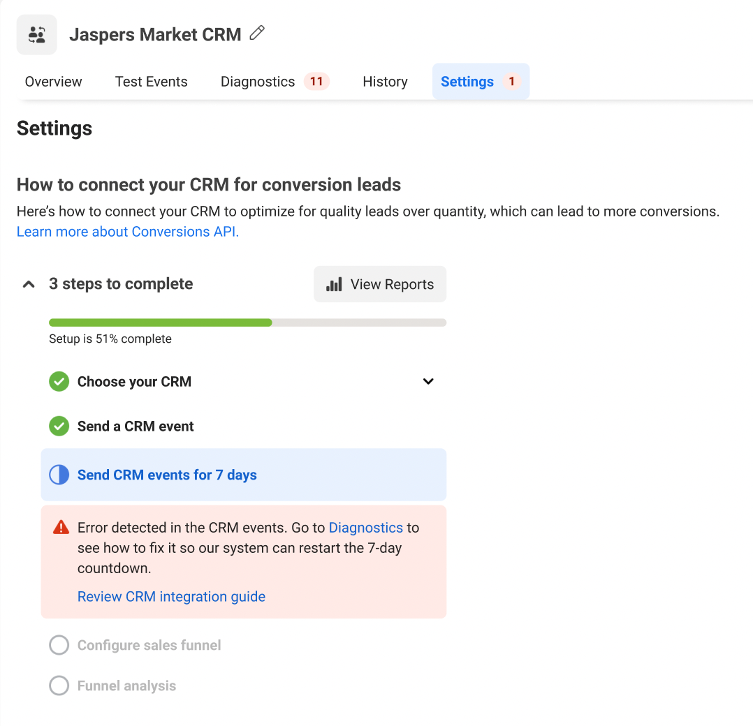
I rewrote the error states to make the problem easier to understand and the next action easier to take.
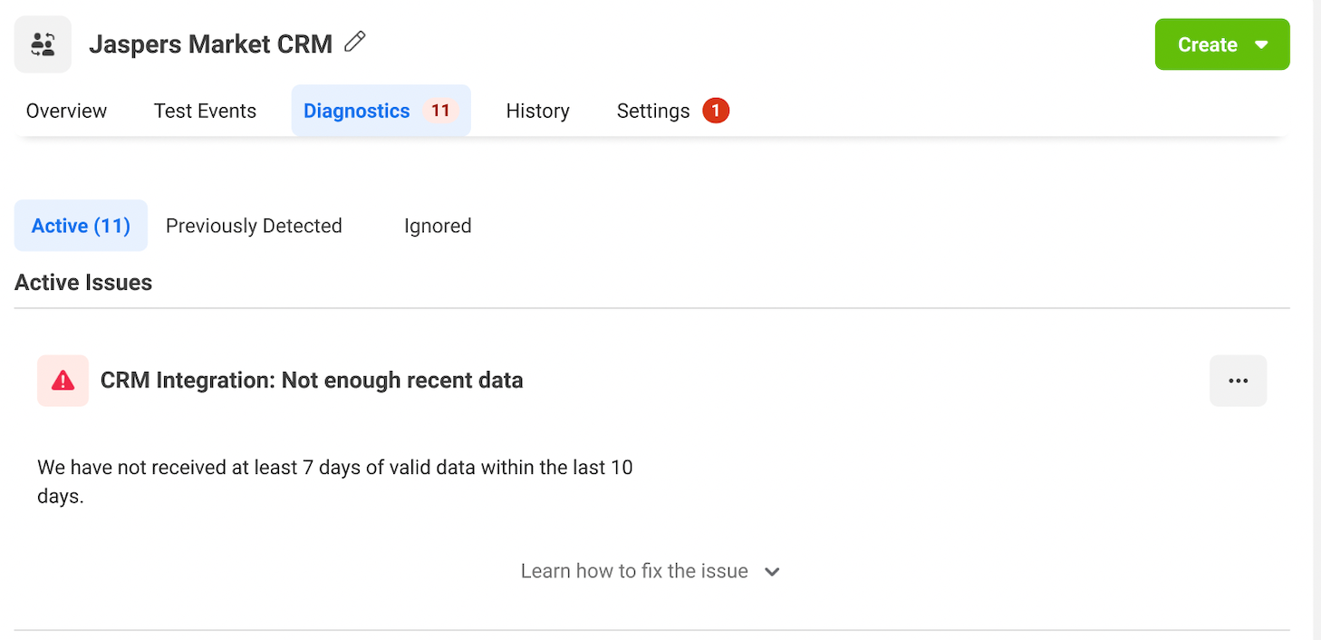
The redesigned error message included more direct language and expandable guidance so users could see what they needed to do next.
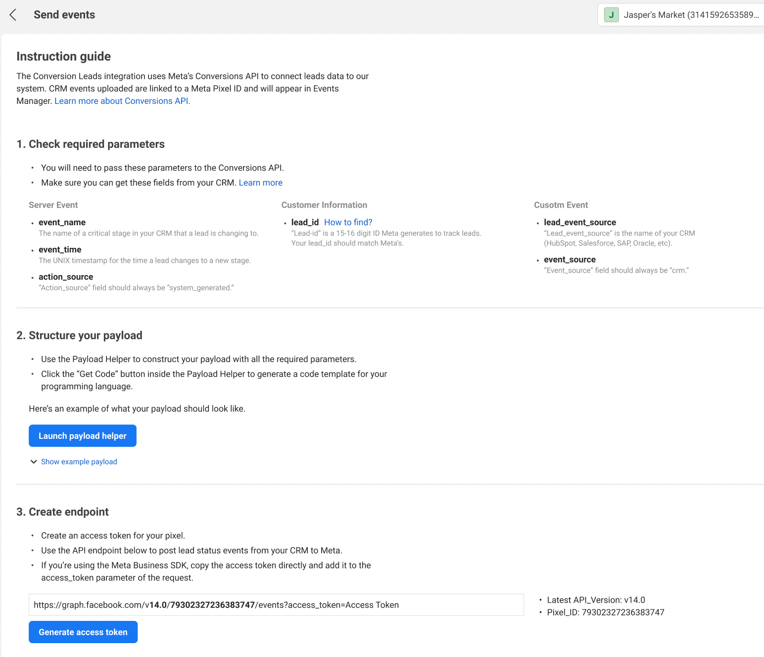
I also simplified an in-product instruction guide and added links to external documentation when the steps were too detailed for the product screen itself. The original in-product guide was 3x as long as this final example in terms of copy.
User testing win
User testing was not in the launch timeline but I felt like this flow was too important to ship without any testing. I leaned on relationships I had built with others and found key partners to push hard for a smaller, faster testing plan that we could fit in before launch.
Business results
- Helped make the manual CRM integration flow easier to understand and complete.
- Improved alignment between product experience, developer documentation, help content, and marketing language.
- Supported adoption of the Conversion Leads product by making setup guidance clearer for advertisers and developers.
- After the redesign, the Conversion Leads product reached a $1 billion annual run rate for the first time.
User results
- Made a technical setup flow feel more understandable and less intimidating.
- Helped advertisers choose the right integration path for their business.
- Reduced confusion around status, next steps, and error recovery.
- Gave developers clearer documentation when they needed deeper implementation details.
- Helped advertisers get more value from the product by making the setup process easier to follow.